Responsive Website Design, providing access to everyone
Monday, 23-05-22, Nick Zoumpoulis

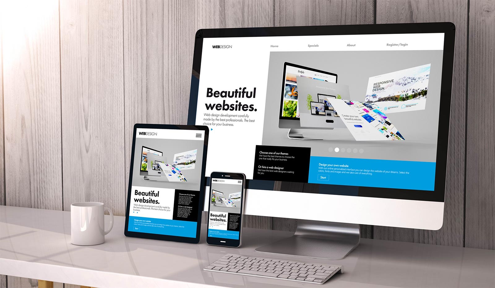
By using the term Responsive Web Design we refer to the development of websites that have the ability to adapt automatically to all modern web navigation devices. These include Desktop PCs, Laptops, Mini Laptops, Net Books, Tablets and Smartphones, and Responsive Web Design provides an ideal and extremely usable navigational environment to all visitors.
A few years ago, during the first release of alternative web navigation devices, such as smartphones and tablets, many developers preferred to design their projects by using two main versions, one for PCs and one for portable devices. The idea was to redirect visitors to the appropriate version according to their device. This was accomplished via client side scripting technologies such as JavaScript. This technique became very popular and it is currently used by few companies and popular websites.
Nowadays, by using new technologies such as HTML5 and CSS3 we are able to offer multiple levels of navigation without the need of client scripting languages. The basic technique behind Responsive Web Design is CSS’s media queries which can be used by developers to apply numerous visibility levels according to specific screen dimensions and devices.
Since 2013, Responsive Web Design became widely known and it is currently used by many companies and website developers worldwide. Moreover, frameworks have been developed specifically for Responsive Web Design which can provide an excellent basis for developers who choose to go responsive. Such frameworks include Bootstrap, 1140 & 960 Grid, Foundation, Skeleton, Gumby and more.
INTERNETi utilizes Responsive Web Design since 2014 and has developed its own framework which is currently used in the majority of our projects. We have also used popular frameworks such as bootstrap or 960 Grid for research and development purposes in specific projects. The main reason behind our own Responsive Web Design framework development was learning and adapting to a new technology from scratch since we always tend to read, examine, analyze and experiment in new technologies and techniques.
It is worth mentioning that as HTML 5 technology as well as other technologies (CSS, JQuery etc.) are constantly being developed, the potential of websites that use Responsive Web Design, regarding website navigation via mobile phones, tends to reach or even surpass native mobile applications.
By using technologies such as advanced HTML5 Geolocation that efficiently uses the GPS and other technologies that make use of smartphones’ capabilities, web developers can achieve almost everything.
Last but not least, after Google’s latest update in terms of Search Engine Optimization and organic search results, websites that make use of Responsive Web Design are ranked higher compared to old websites that are developed for a single platform.
